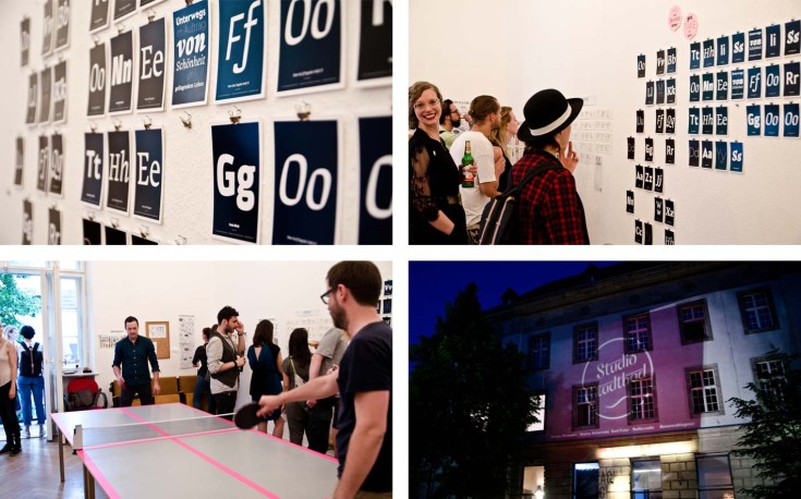
12.06.2015
Berlin Design Night
Nachtschicht 2015
On June 12th the third edition of Create Berlin’s Berlin Design Night took place. Together with our colleagues from Rattlesnake, Bananenbiegerei, Emil Futur and Sophia Halamoda we opened the doors of our studio to welcome all of you – thanks for coming and making it a memorable evening with inspiring talks, drinks, great music and ambitious pingpong matches on our improvised Eiermann-pingpong-table. Can’t wait for next year!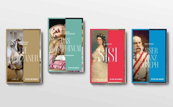
21.05.2015
Book series
Myth & Truth
The book series my partner in crime from Vienna, Cora Akdogan, and I designed for Christian Brandstätter Publishers is growing and growing. Just recently the fourth issue was released – about the probably most famous horses in the world (or at least Austria)…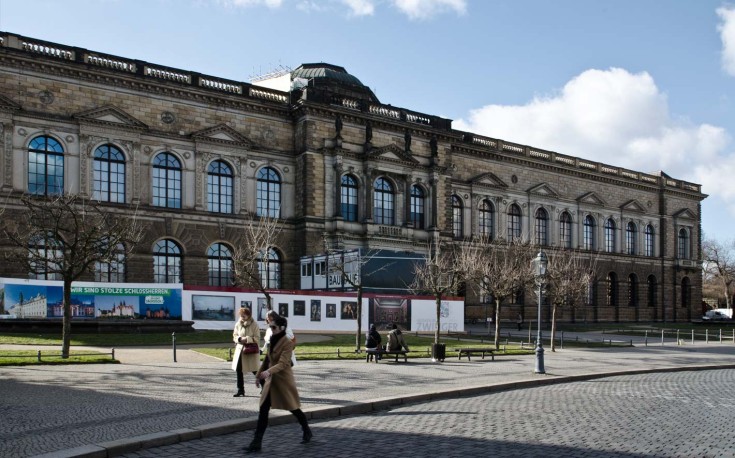
30.04.2015
Signage
Old Masters Picture Gallery, Zwinger Dresden
Together with fellow Leipzig based design studio Gourdin & Müller we are working on a new signage for the Gemäldegalerie Alte Meister (Old Masters Picture Gallery) at the Dresden Zwinger. The collection of more than 750 paintings from the 15th – 18th century is regarded as one of the most important and is being renovated at the moment. The opening of the first part of the gallery is scheduled for late 2015.Since early 2014 we’re working on the planning, developing and the design of the new signage, that will guide visitors through the impressing building of Georg Semper in the future. Stay tuned for more…
11.02.2015
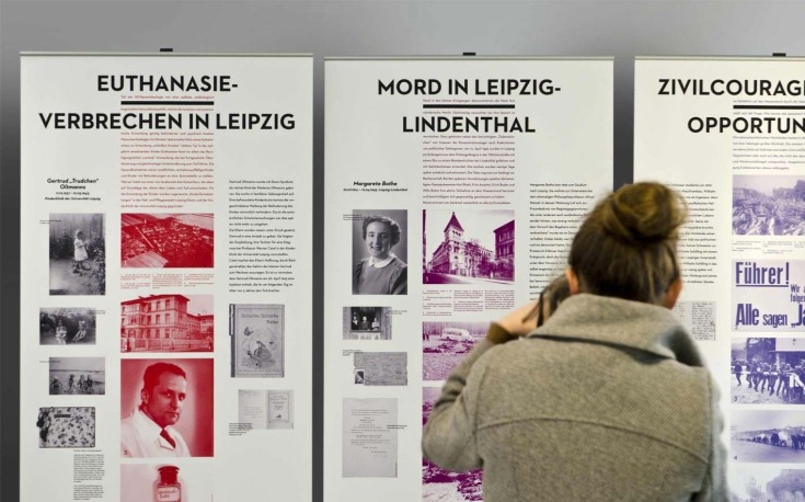
Travelling exhibition
Stolpersteine
We designed the banners for the new travelling exhibition about “Stolpersteine” in Leipzig. Individually selected cases with portraits, documents, diary entries and texts are freely arranged around a static, duplex-coloured historical middle axis, that puts personal the fate of victims in a broader socio-historical context. Transfering the all-to-well known historical documents such as pictures of concentration camps, iconic buildings and disturbing decrees by the Nazis into an iridescent colour range takes away some of the historical weight and creates a very modern feel to the whole exhibition. In the end, it was not an easy topic, however a very beautiful project!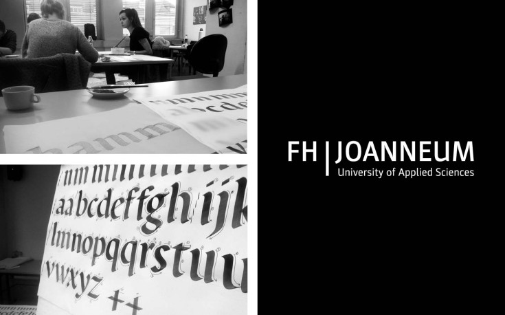
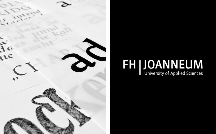
15. – 17.01.2015
Lecture & Workshop
FH Joanneum, Graz, AT
Über-Schrift: What’s so elemental about typedesign? And why do graphic designer don’t really know much about it? Why do you keep on designing new typefaces when there seems to be enough type already? And why does that always take so long? Generally: why does good type need to be so "expensive"? And how am I supposed to tell a good from a bad typeface? These are only some of the topics I’m trying to cover in my talk and the 2-day workshop at University of Applied Sciences in Graz, Austria.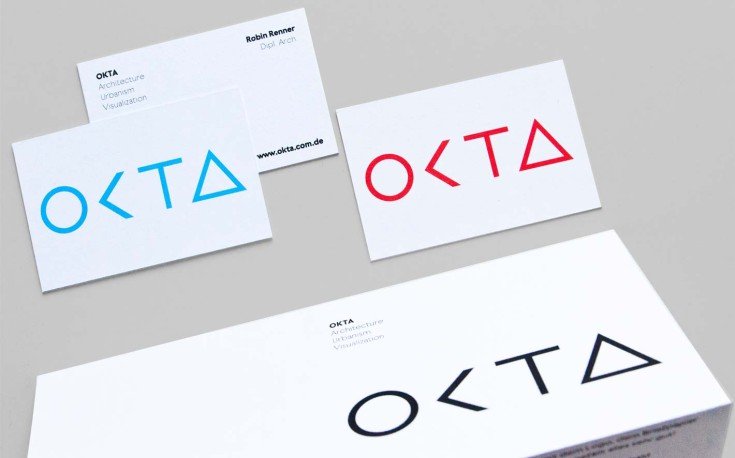
09.11.2014
Logo & Corporate Design
OKTA
Sleek, functional, modern and timeless – we designed the logo, stationary and (soon) website for fellow Stuttgart based architect OKTA. The almost architectural looking logotype, which is strictly reduced to basic geometrical shapes such as circle, square, triangle is built upon shapes that are also inherent parts of the archetypical canon of forms in architecture itself.More to come soon…
24.09.2014
Book series
Mythos und Wahrheit / Myth and Truth
Sisi, The Josephinum, Kaiser Franz Joseph, Schönbrunn – Viennese icons that are well known even in hidden places at the back of beyond. This newly developed and designed series – in close cooperation with Viennese designer Cora Akdogan – takes a fresh look at some of these icons – visually not like most of the books in the tourist shop around the corner.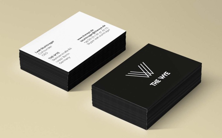
01.08.2014
Corporate Identity
THE WYE
THE WYE is not just a gallery, it is not just a co-working space for artists, designer, start ups and engineers, it is not just the organizer and curator of various exhibitions across the globe.First and foremost, THE WYE is a new way of collaborative working at the intersection of art, design and technology, an international network that empowers and connects creatives, engineers, scientists and entrepreneurs to pioneer new forms of creative expressions and to apply technology innovations to businesses that create meaningful value for people in our digital culture.
Together with Nadine from JUST DAMN R!GHT and in close cooperation with THE WYE, we develop, design and optimize the comprehensive corporate identity of THE WYE, ranging from logotype and stationary to digital and analogue brochures to supporting their digital brand management across various social media channels.
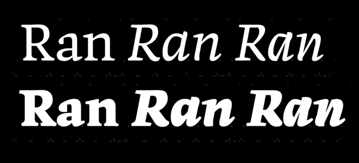
28.04.2014
Dato Serif Black
Work in Progress
Sometimes you have to put a project aside for a longer period of time before picking it up again. So, some weeks ago now, I started working on Dato again, since there’s still a huge amount of work to do before it can possibly be released: correction of single masters (or redrawing them from scratch), extending character sets, as well as adding a Black for all 6 styles of Dato Regular… Still a long way to go.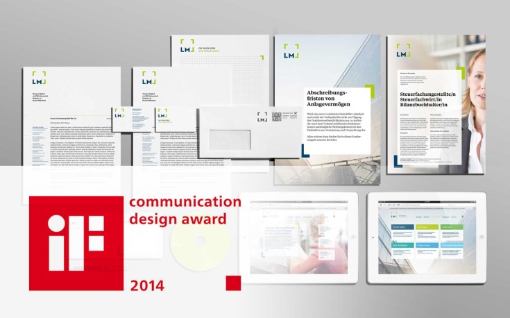
23.01.2014
New Corporate Identity
LM wins at the iF Communication Design Awards
We’re very proud to say that the new corporate identity we developed together with the guys from Morgen Digital for LM Audit & Tax just won one of this years’ iF Communication Design Awards. Yeah!
31.12.2013
Over. And out.
Thanks for a great 2013, wishing all of you all the best for 2014!
05./06.12.2013
Workshop
University of Applied Sciences, Graz, AT
Hello Graz, long time no see. I’m really looking forward to being there again… Further information and pictures to come…
30.10.2013
New Corporate Identity
Bayerische Akademie für Werbung und Marketing
We designed the new Corporate Identity for BAW (Bavarian Academy for Advertising and Marketing). Together with the guys from Morgen Digital, who were responsible for the new website and Brand Identity, we developed the new brand and refined its branding guidelines carefully in a long and demanding process, that asked for a shift of a long established brand in German advertising scene.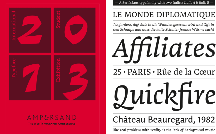
28.06.2013
Exhibition
Ampersand Conference, Brighton, UK
Proud to say that Dato Sans and Dato Serif are part of this years first ever student typeface exhibition hosted in conjunction with Brighton’s Ampersand Conference.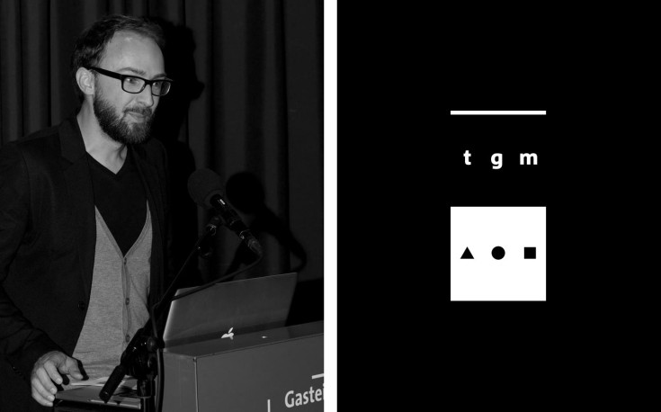
11.06.2013
Lecture
Typographische Gesellschaft Munich
15 minutes about developing Bergamo, 15 minutes about why it sometimes takes years to design a typeface and 15 minutes about why you sometimes discard decisions over and over again, just to make new ones, better ones…