Lektorei
Logotype, Corporate Design and Website
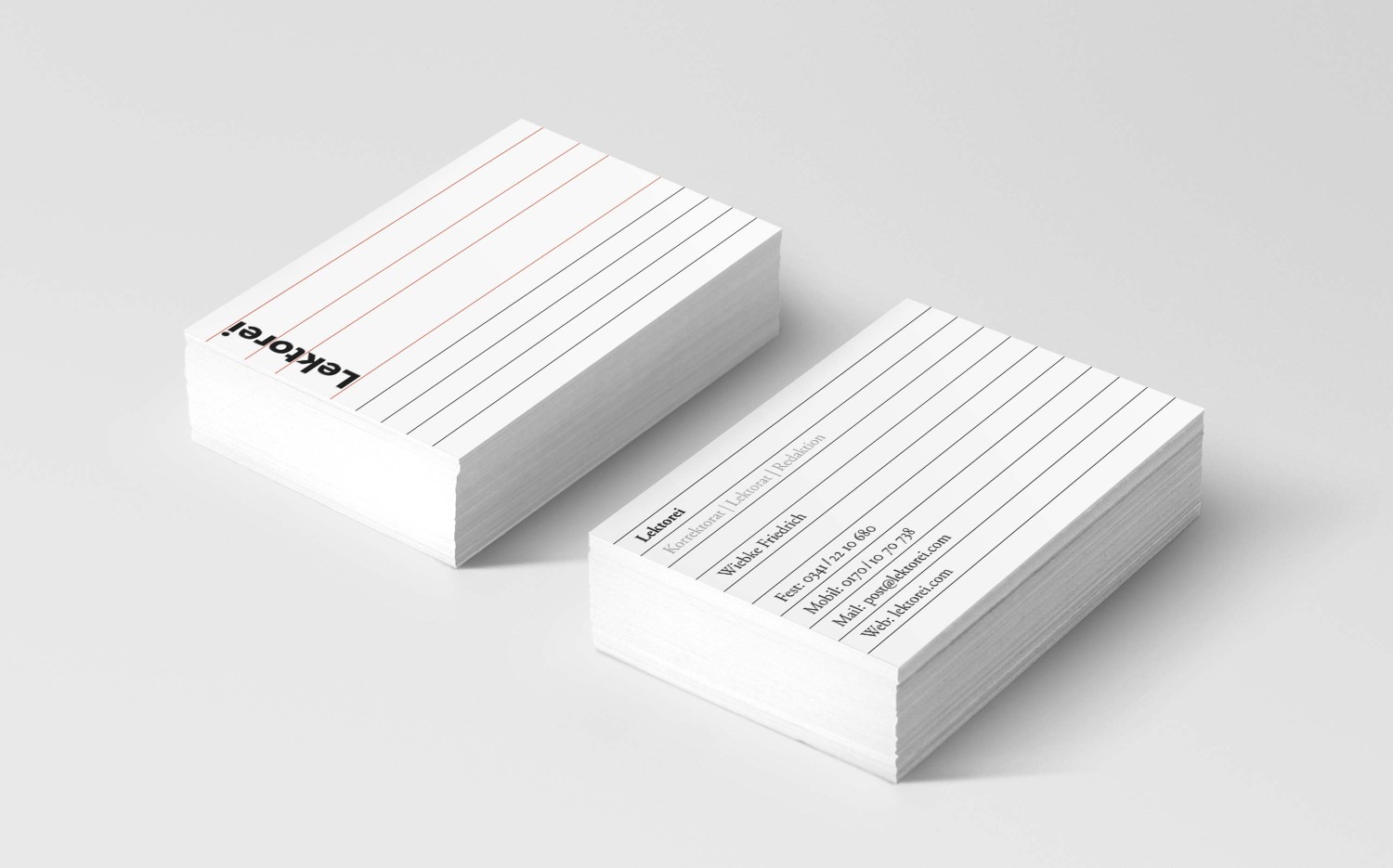
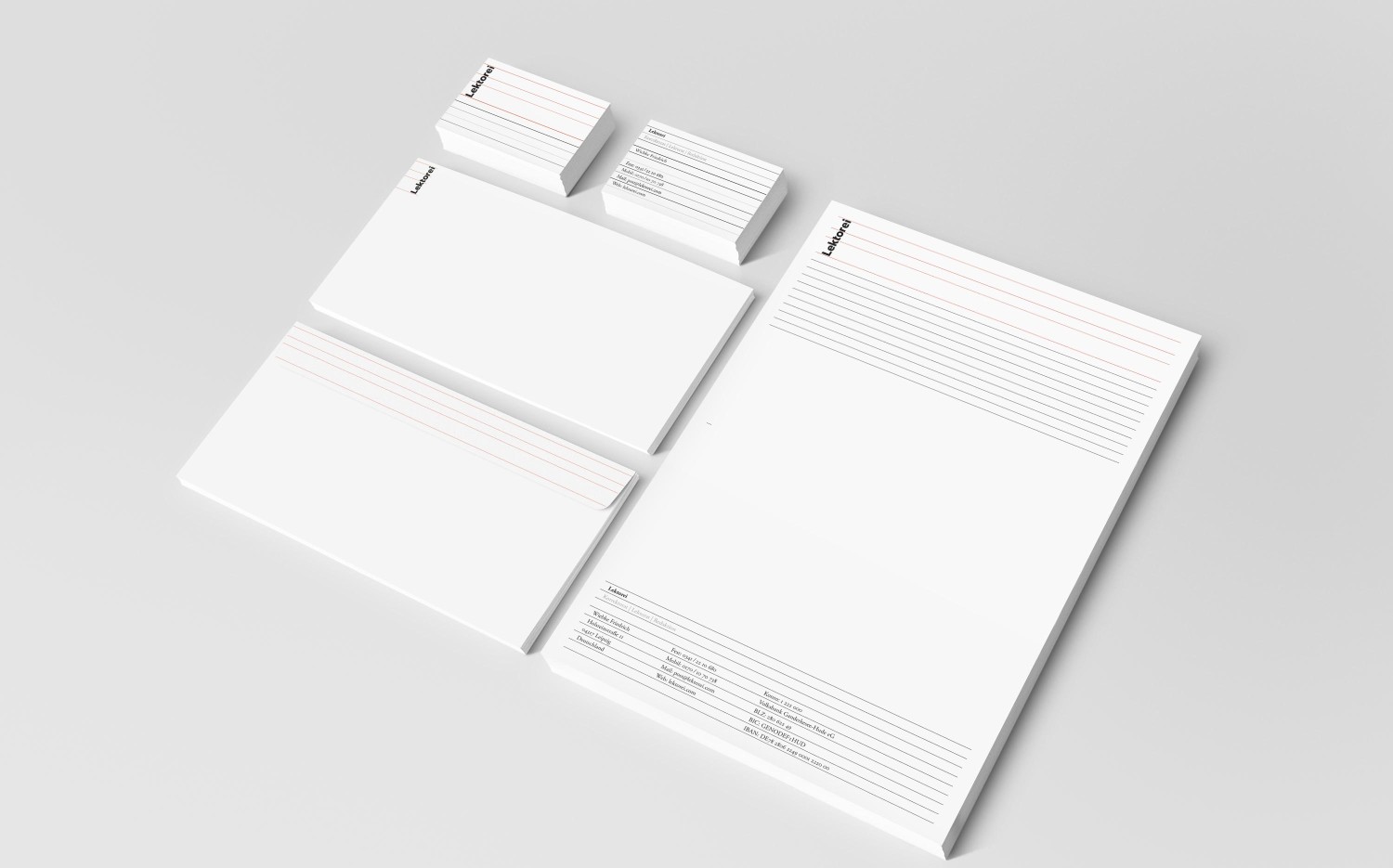
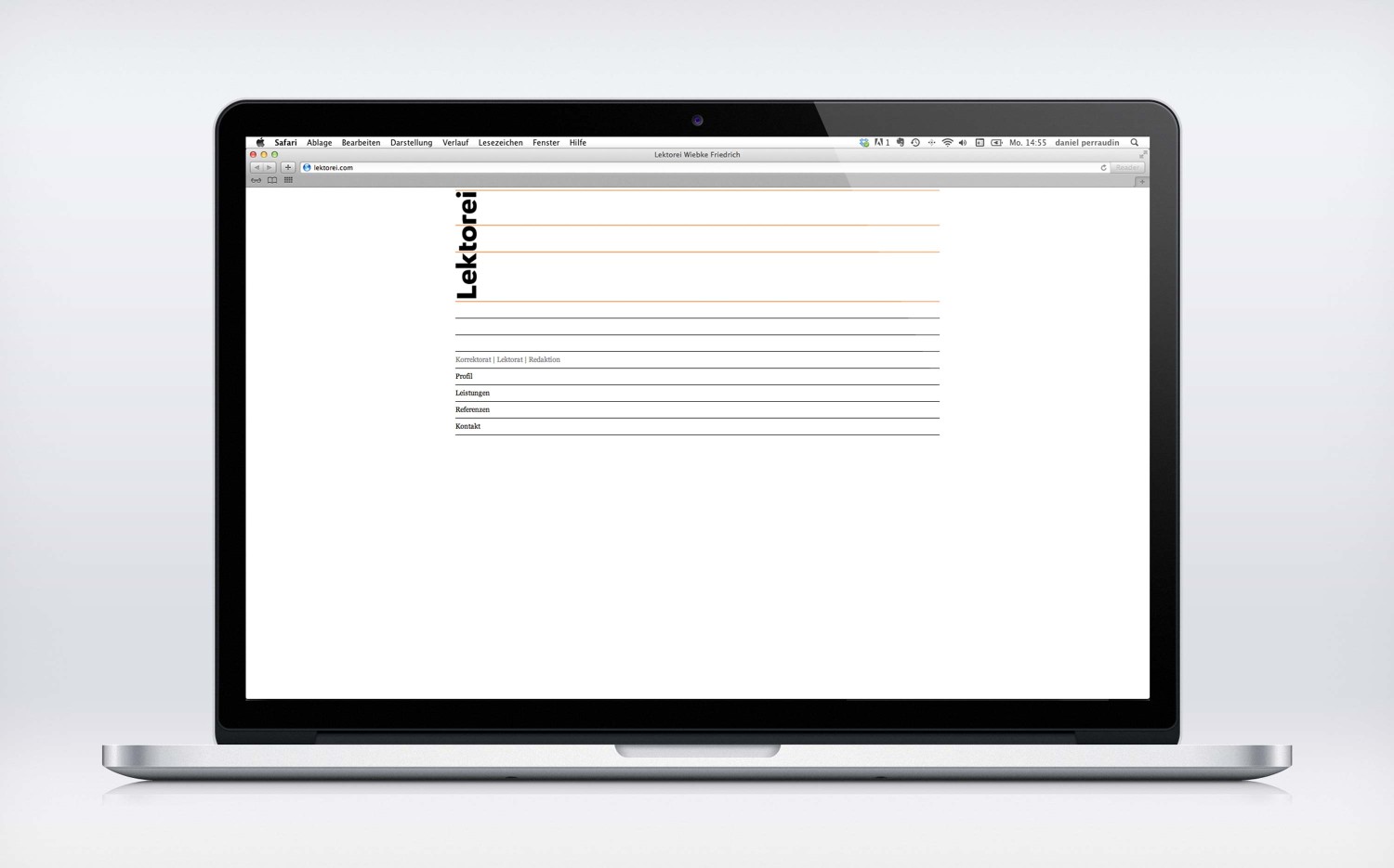
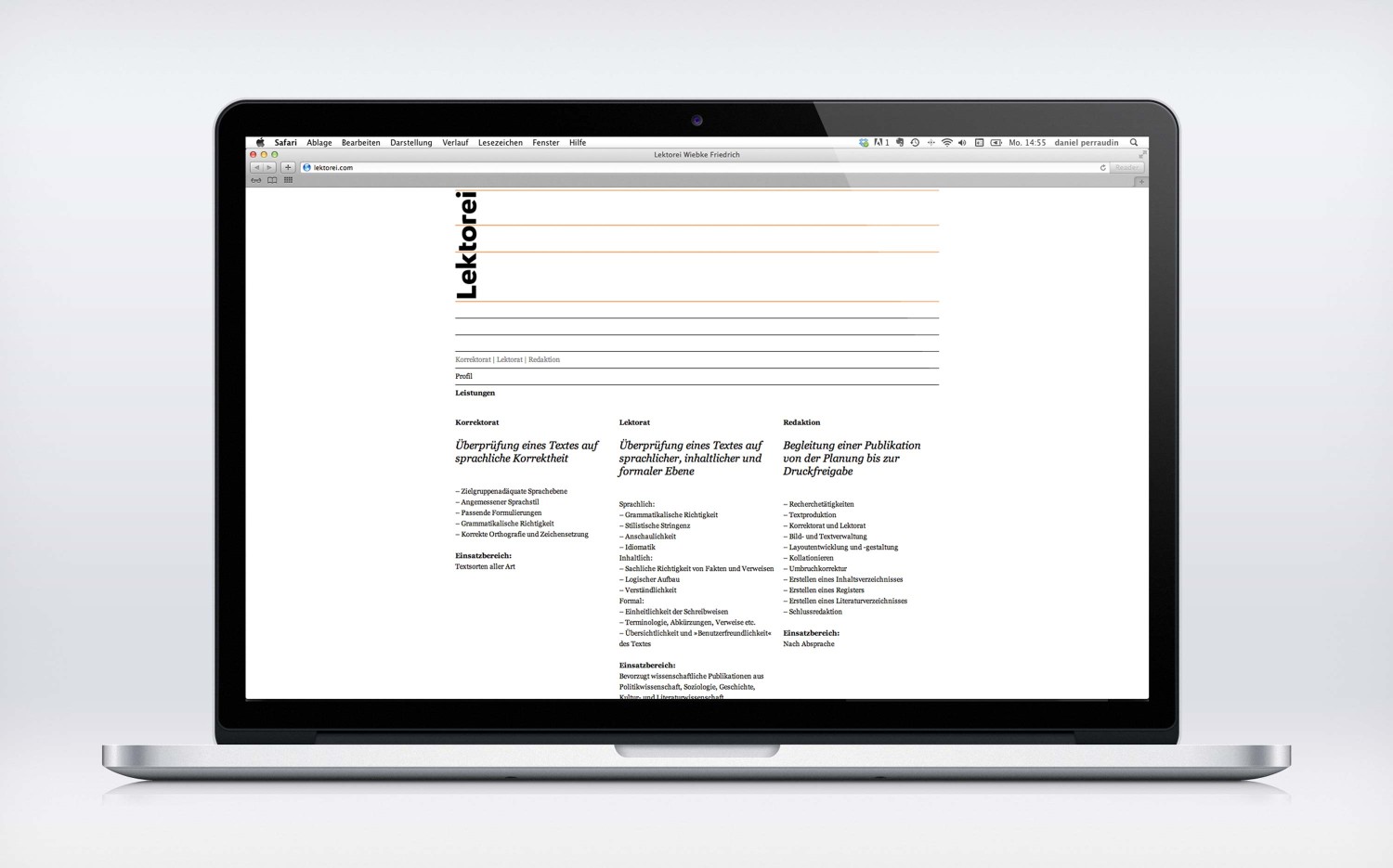
Reading and correcting texts of all sorts, lectors have to be aware of a million different rules – one of which is hyphenation. The custom German wordmark is based on the trisyllabic word “Lek•to•rei” and divided by vertical lines. Turning the logotype by 90° results in a basic grid for Lektorei’s stationary and website. Online the lines even work as some kind of menu structure, which can be expanded and collapsed dynamically and thus reveal the content “between the lines”.
Projectlektorei


