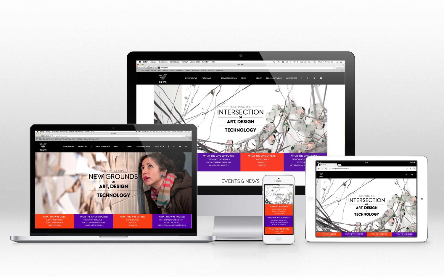
THE WYE is a hybrid that melds the most productive elements of institution, creative agency, accelerator, art house, community initiative, incubator and lab into one company to evolve culture, industry and society.
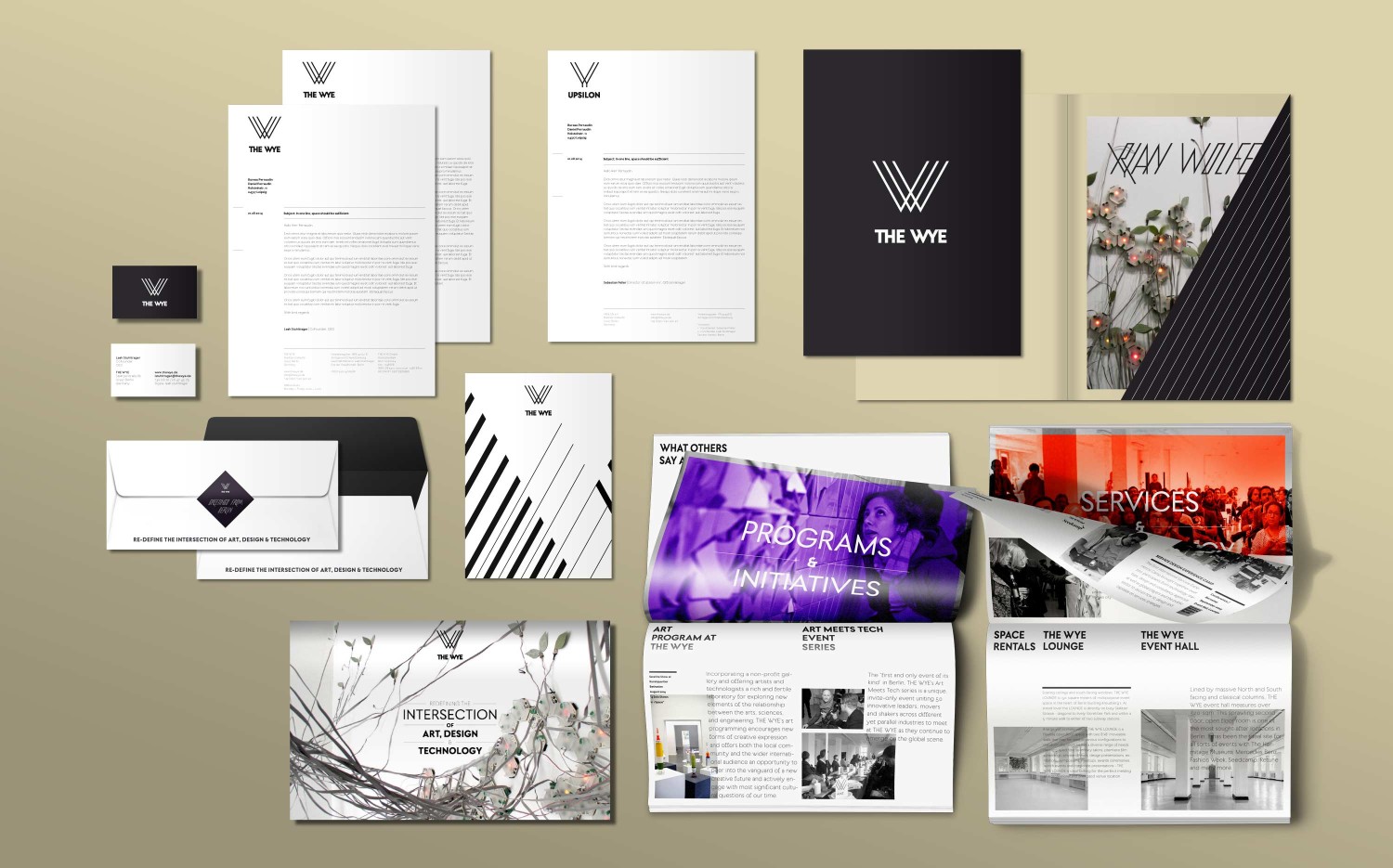
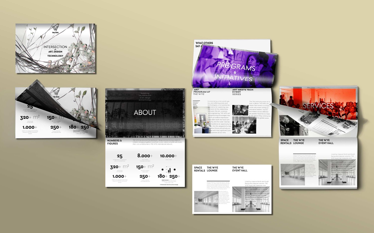
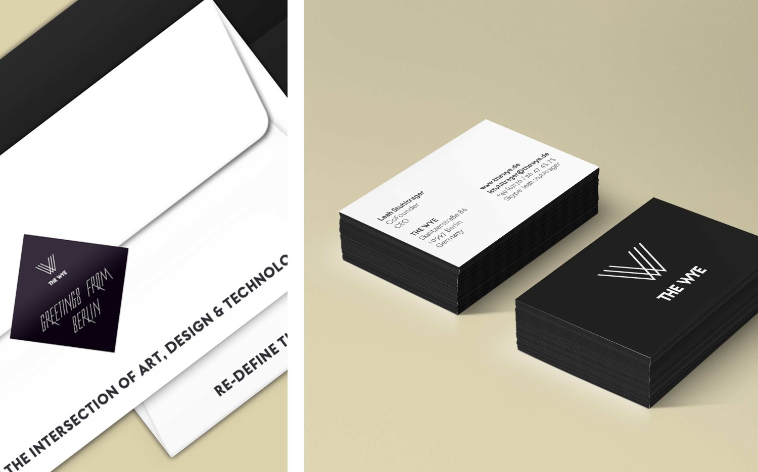
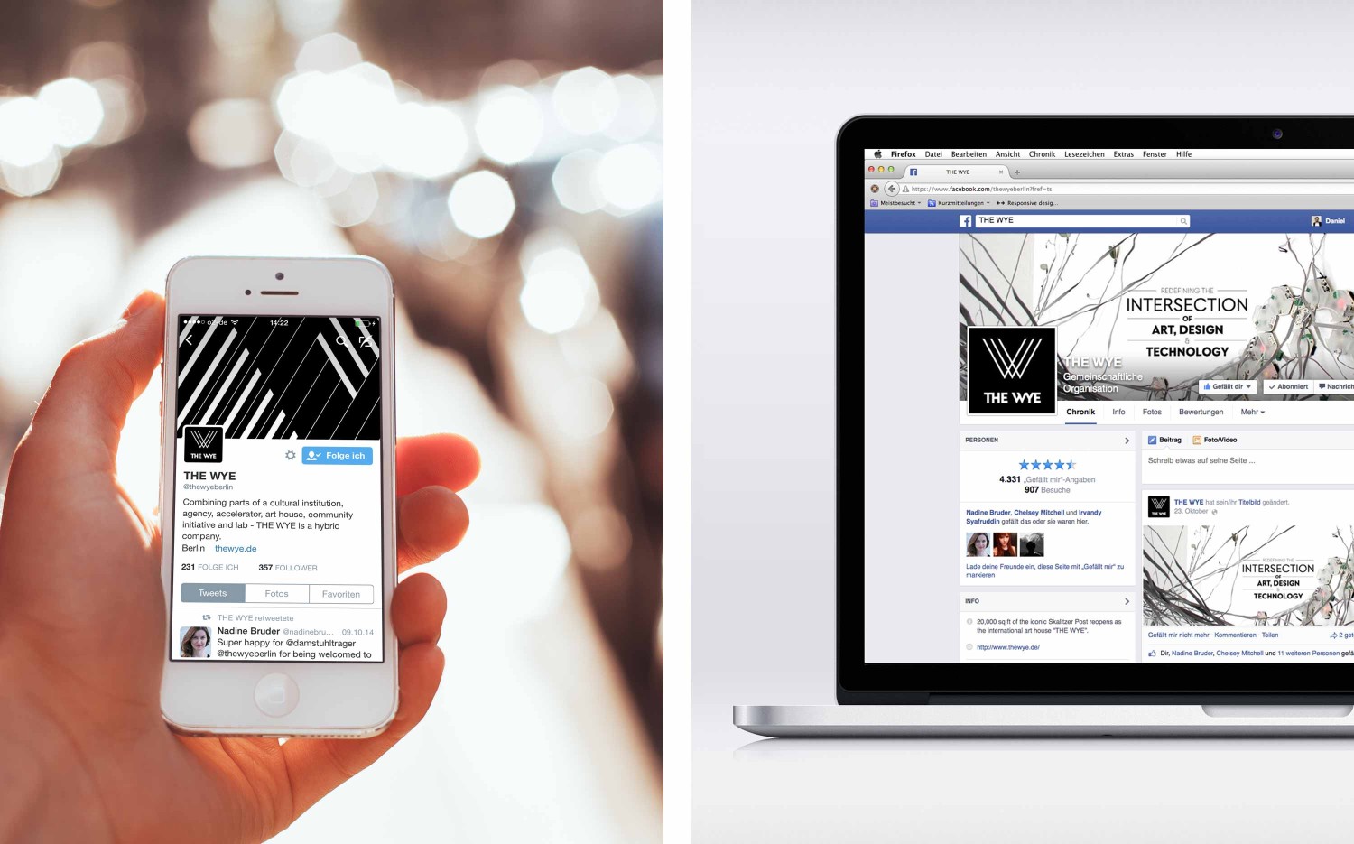
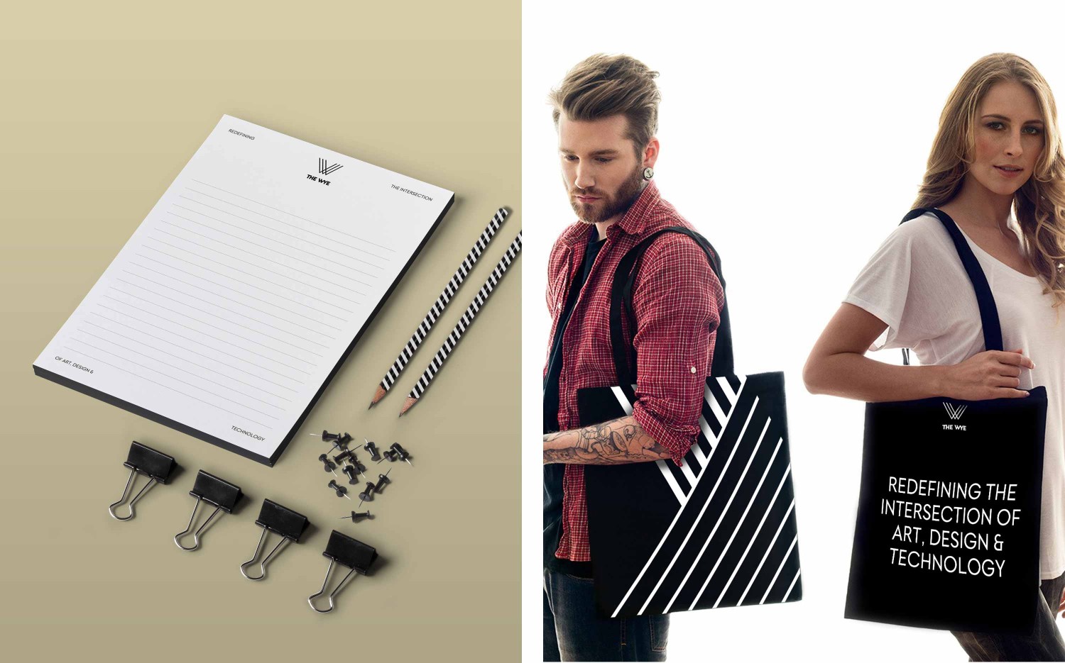
Together with Nadine from JUST DAMN R!GHT we developed, designed and optimized the comprehensive corporate identity system of THE WYE, ranging from logotype and stationary to brochures to supporting their digital brand management across various social media channels.
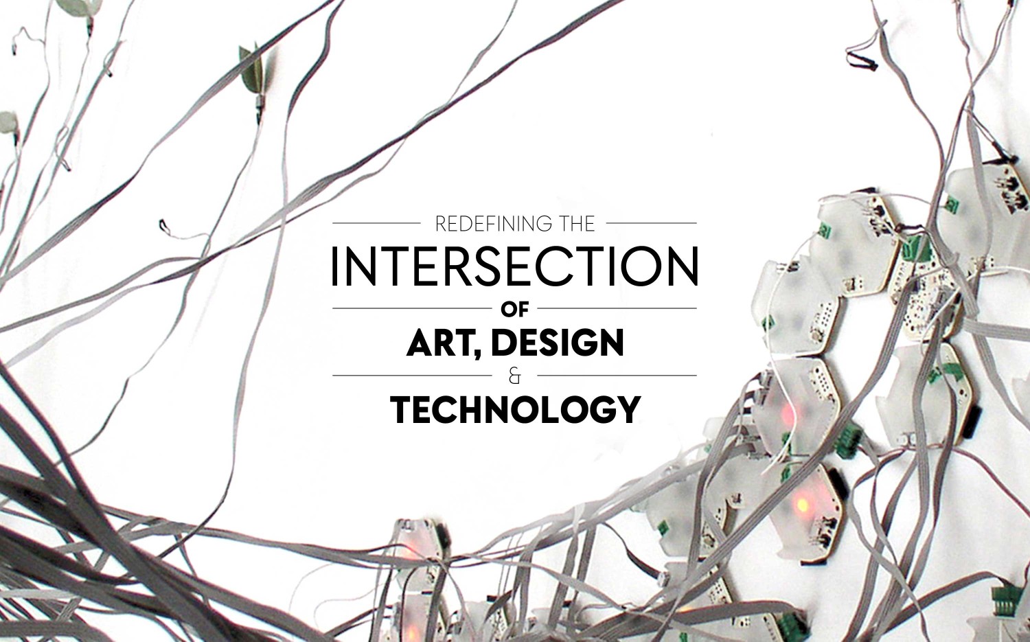
Within this process JUST DAMN R!GHT first captured what THE WYE actually is in all its facets and translated the brand’s mission into a guiding yet engaging brand statement: Redefining the intersection of art, design and technology.
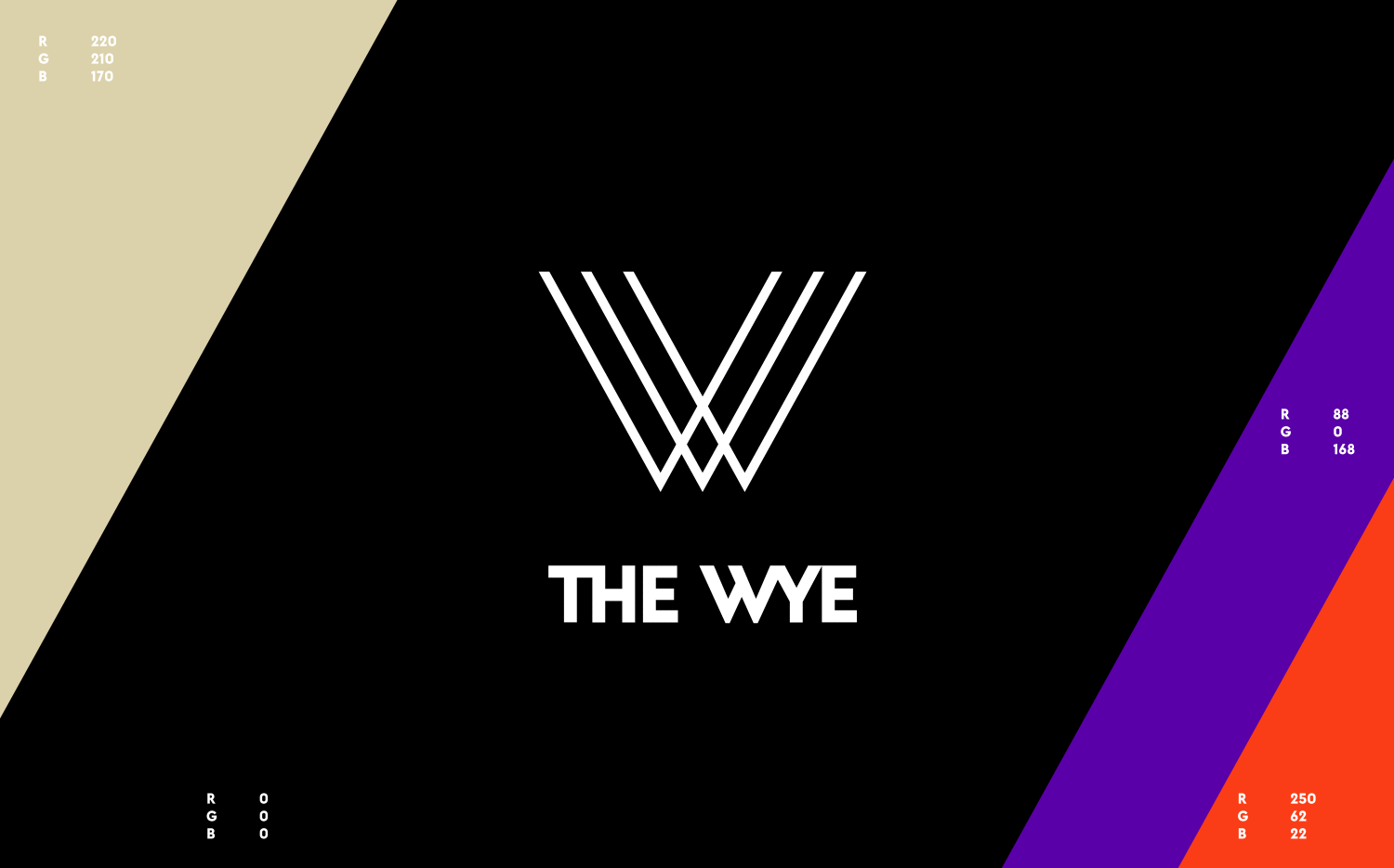
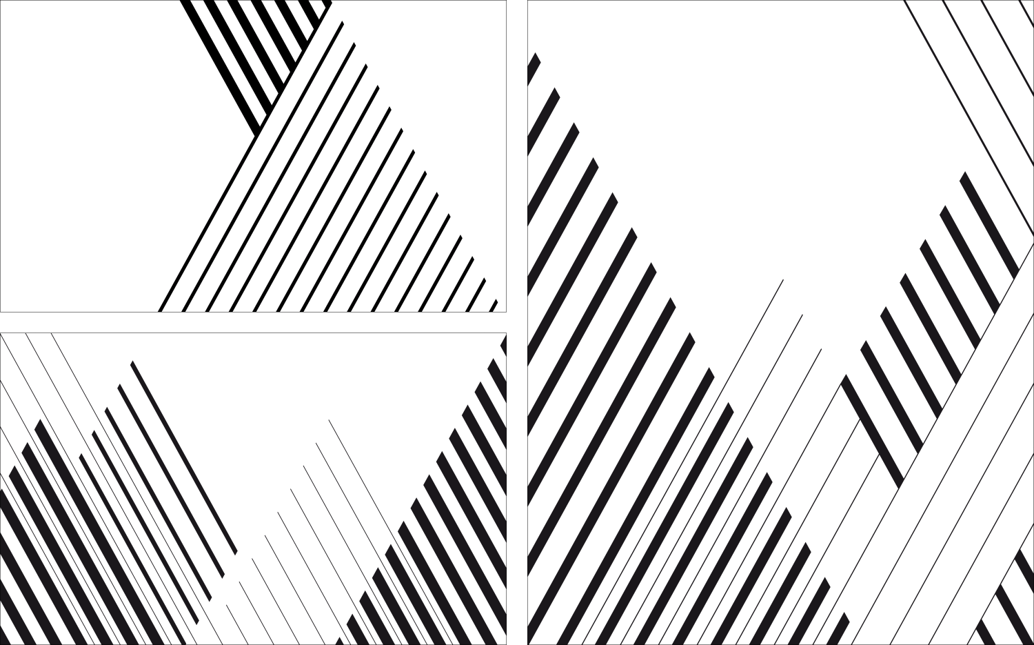
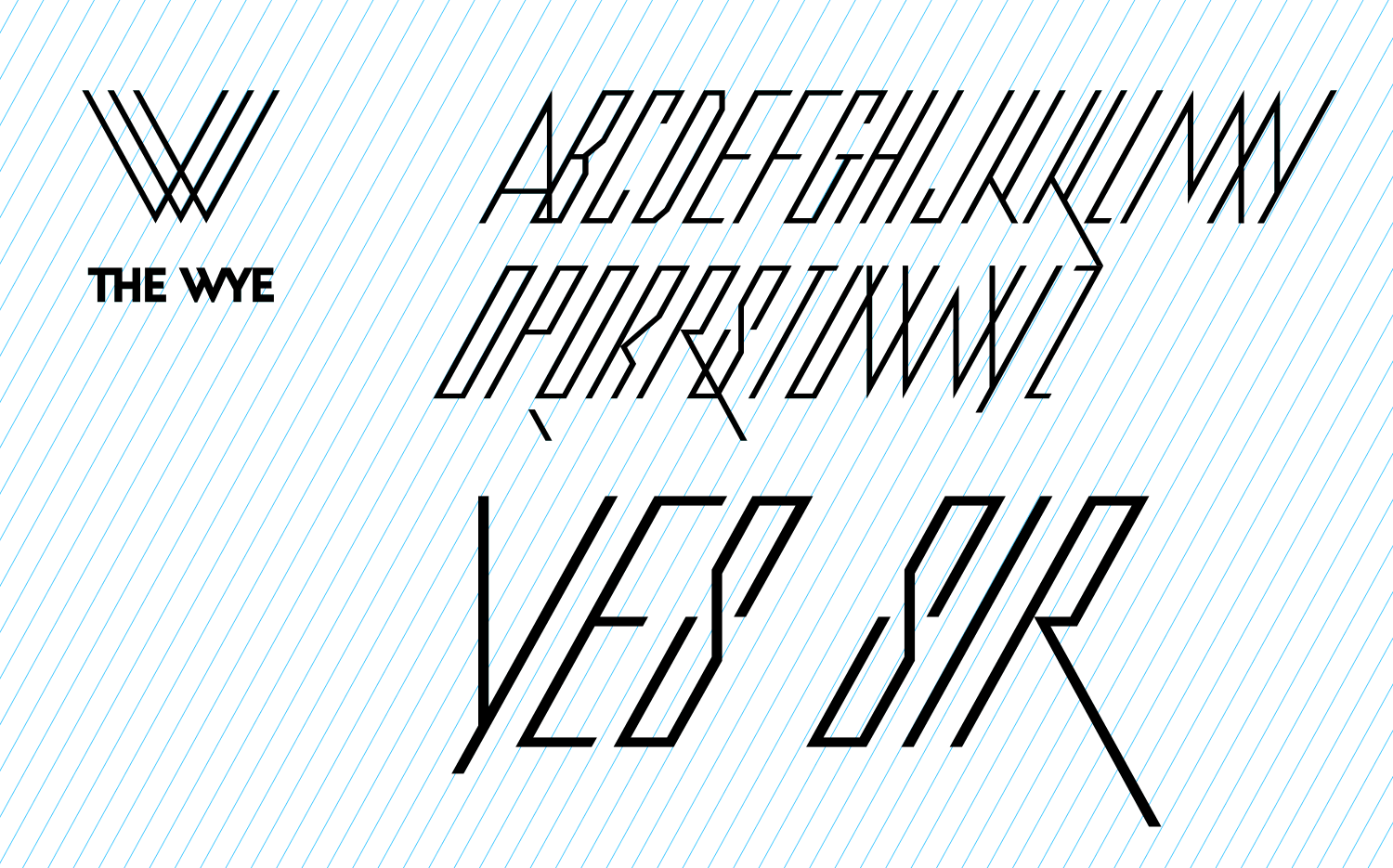
Second we improved the existing logo and jointly developed and designed a new visual identity system which is founded on the idea of a Y-shaped track arrangement and the angular degrees of where lines in the visual merge. We also created a custom headline font that extends the diagonal design principles into typography. The entire branding system is drawn on this geometry, from the word and logo mark to brand architecture, typography, graphics and visual patterns across print and digital media. Due to its geometric rules the system stays consistent, but at the same time offers dozens of possibilities to create flexible, visually unified design solutions.
Projectthe-wye-2
