2009 – 2014
8 styles (4 weights w/ Italics)
Glyphs: 893 (Roman) / 926 (Italics)
Available soon!
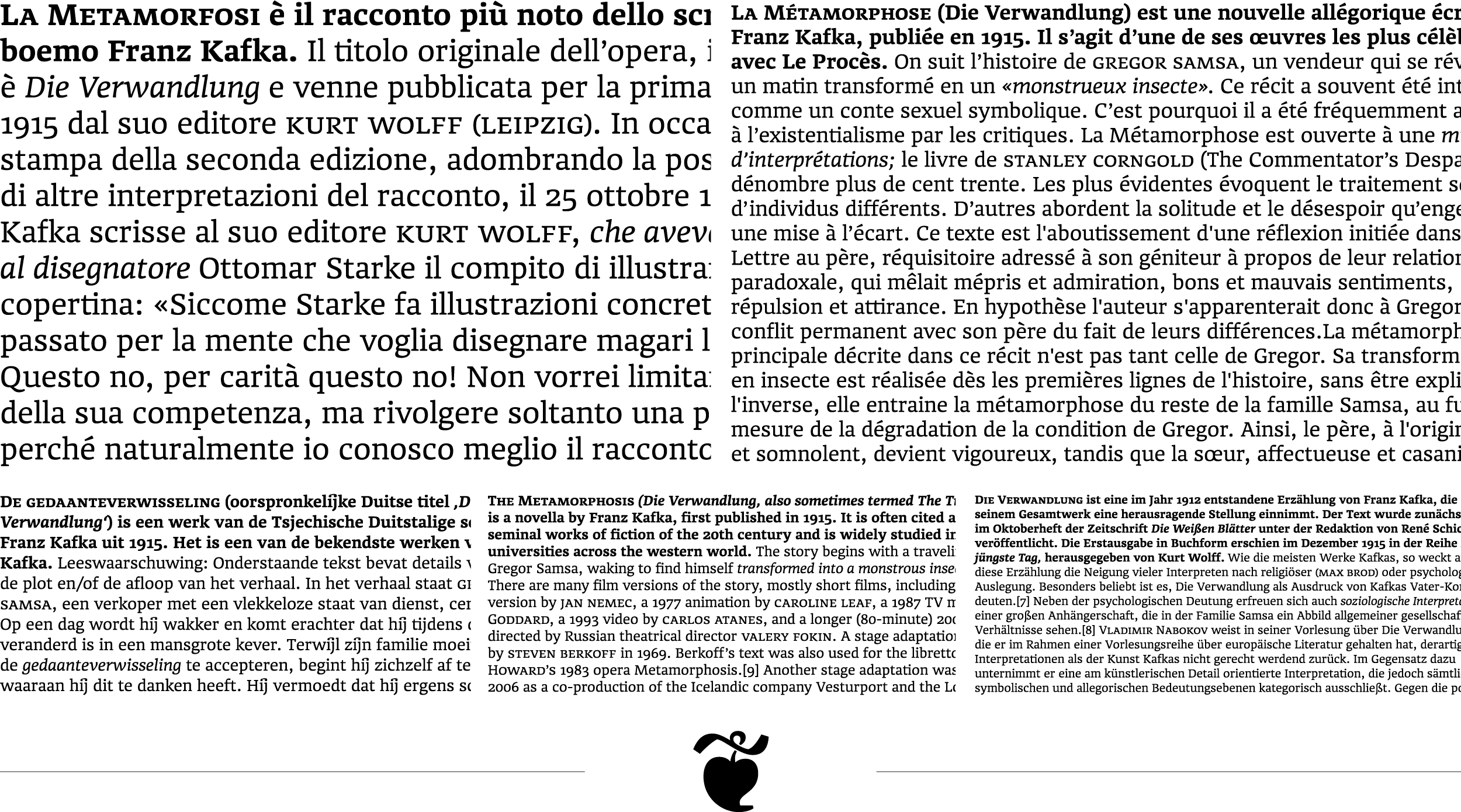
Bergamo is a very comprehensive book typeface. Its robuste, sturdy appearance and its almost slab-like serifs, the extremely high x-height as well as short ascenders and descenders make it perfectly suitable even for difficult printing surroundings – like books, journals and newspapers.
Bergamo’s emphasis on the horizontals in the Roman, as well as the more elegant, powerful Italics give it a strong impression and perfect readability, even in small sizes. However, in display sizes Bergamo reveales a bunch of subtle details, such as open lobes of “B”, “P” & “R”, slightly curved diagonal endings in “M” and “N” and a slight counterclockwise shift of the upper and the lower serifs. Additionally a bunch of standard and discretionary ligatures make Bergamo a beautiful workhorse even in the most demanding situations.
Specimen
Styles
Features
Zeichensatz
Bodytext
